Better Nutrition
Better Nutrition
Better Nutrition

Project Brief
In a saturated market of vague 'healthy' claims, Better Nutrition introduces bio-fortification as a clear, science-backed approach to everyday nutrition. The goal was to rebuild a brand that is both credible and accessible, using naturally grown, nutrient-rich seeds to deliver measurable benefits and stand out through transparency. We needed to make the brand instantly recognizable and meaningful to both new and existing audiences.
In a saturated market of vague 'healthy' claims, Better Nutrition introduces bio-fortification as a clear, science-backed approach to everyday nutrition. The goal was to rebuild a brand that is both credible and accessible, using naturally grown, nutrient-rich seeds to deliver measurable benefits and stand out through transparency. We needed to make the brand instantly recognizable and meaningful to both new and existing audiences.
My Approach
We didn't just want to design packaging; we wanted to build a system that could scale. That's why every element was carefully considered, from the rich green that evokes purity to the distinctive seal that highlights their nutritional edge. And with PV Sindhu as their brand ambassador, we created a visual language that has simple data-driven visuals, and informative packaging, it communicates what the product is, how it works, and why it matters, which creates a distinct, trustworthy presence in the market.
We didn't just want to design packaging; we wanted to build a system that could scale. That's why every element was carefully considered, from the rich green that evokes purity to the distinctive seal that highlights their nutritional edge. And with PV Sindhu as their brand ambassador, we created a visual language that has simple data-driven visuals, and informative packaging, it communicates what the product is, how it works, and why it matters, which creates a distinct, trustworthy presence in the market.
Project Type
Brand Identity, Packaging & Ecosystem Design
My Role
Associate Designer
Client
Better Nutrition


The Logo
The Better Nutrition logo is built around the idea of a 'super seed', a simple symbol that brings together both science and nature. The seed conveys growth and innovation, subtly hinting at the power of bio-fortification through its visual presence. With a bold, clean typeface and a rich green colour, the logo feels both natural and trustworthy while still carrying a clear, science-driven edge. The brand identity brings this seed to life, showcasing the potential of bio-fortification to nourish lives.
The Better Nutrition logo is built around the idea of a 'super seed', a simple symbol that brings together both science and nature. The seed conveys growth and innovation, subtly hinting at the power of bio-fortification through its visual presence. With a bold, clean typeface and a rich green colour, the logo feels both natural and trustworthy while still carrying a clear, science-driven edge. The brand identity brings this seed to life, showcasing the potential of bio-fortification to nourish lives.
Scientific | Natural | Innovative
Scientific | Natural | Innovative
Scientific | Natural | Innovative

Brand Strategy
We wanted to create more than just packaging; we designed a system that could grow with Better Nutrition as the brand expands. Every element was thoughtfully chosen, from the rich green that reflects freshness and trust to the seal that highlights the brand’s nutritional benefits. With PV Sindhu as the face of the brand, the visual language feels both credible and approachable, helping Better Nutrition connect with both existing and new consumers.
We wanted to create more than just packaging; we designed a system that could grow with Better Nutrition as the brand expands. Every element was thoughtfully chosen, from the rich green that reflects freshness and trust to the seal that highlights the brand’s nutritional benefits. With PV Sindhu as the face of the brand, the visual language feels both credible and approachable, helping Better Nutrition connect with both existing and new consumers.


Packaging Overview
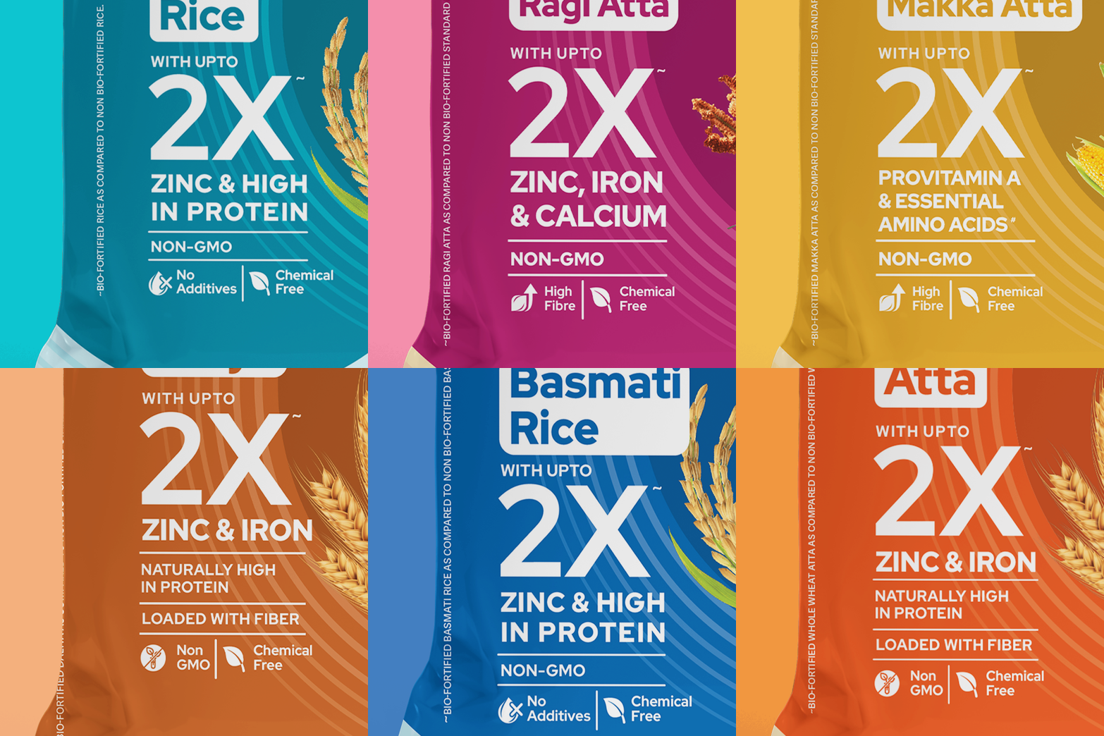
The strong visual hierarchy helps consumers quickly identify the product, its nutritional benefits, and key differentiators. The deep green brand block creates a sense of trust and natural purity and improves shelf visibility. Bold typography and oversized nutritional claims like “2X Zinc & Iron” make the benefits instantly noticeable, reinforcing the brand’s focus on measurable nutrition. The visual language was developed by combining clean, minimal layouts with subtle scientific and agricultural cues. This system was designed to be flexible and scalable, allowing the visual identity to extend seamlessly across different products, pack sizes, and future brand applications while maintaining consistency and strong shelf presence.
The strong visual hierarchy helps consumers quickly identify the product, its nutritional benefits, and key differentiators. The deep green brand block creates a sense of trust and natural purity and improves shelf visibility. Bold typography and oversized nutritional claims like “2X Zinc & Iron” make the benefits instantly noticeable, reinforcing the brand’s focus on measurable nutrition. The visual language was developed by combining clean, minimal layouts with subtle scientific and agricultural cues. This system was designed to be flexible and scalable, allowing the visual identity to extend seamlessly across different products, pack sizes, and future brand applications while maintaining consistency and strong shelf presence.


