Haldiram's Frozen
Haldiram's Frozen
Haldiram's Frozen
Project Brief
Haldiram’s Nagpur and Haldiram’s Delhi wanted to bring their frozen-food ranges under one unified identity for export, while retaining the familiarity of their existing packaging. The challenge was to create a packaging system that could bring consistency across very different product categories without losing the distinct character of each range.
Haldiram’s Nagpur and Haldiram’s Delhi wanted to bring their frozen-food ranges under one unified identity for export, while retaining the familiarity of their existing packaging. The challenge was to create a packaging system that could bring consistency across very different product categories without losing the distinct character of each range.
My Approach
The approach was to build a common visual language around something already iconic to Haldiram’s—their use of patterns. Instead of completely redesigning the existing packaging structure, the hierarchy, typography and overall layout were retained, while a new system of colours and patterns was introduced to create a more contemporary and cohesive family across the range.
The approach was to build a common visual language around something already iconic to Haldiram’s—their use of patterns. Instead of completely redesigning the existing packaging structure, the hierarchy, typography and overall layout were retained, while a new system of colours and patterns was introduced to create a more contemporary and cohesive family across the range.
Project Type
Packaging Revamp
My Role
Associate designer
Client
Haldiram's (Pitch)


Play on Patterns
The central idea was to reinterpret Haldiram’s familiar polka-dot language through a more meaningful pattern system. Every pattern begins with a single circle, which is cut, divided, overlapped or repositioned to create a small category-specific icon. That icon is then repeated to form the pattern on the pack. The result is a simple but flexible visual system where each pattern tells a different story—from celebration and indulgence to freshness, wholesomeness and energy. While the patterns differ, their shared construction from one circle ties the entire range together and gives the packaging a distinctive, ownable Haldiram’s language.
The central idea was to reinterpret Haldiram’s familiar polka-dot language through a more meaningful pattern system. Every pattern begins with a single circle, which is cut, divided, overlapped or repositioned to create a small category-specific icon. That icon is then repeated to form the pattern on the pack. The result is a simple but flexible visual system where each pattern tells a different story—from celebration and indulgence to freshness, wholesomeness and energy. While the patterns differ, their shared construction from one circle ties the entire range together and gives the packaging a distinctive, ownable Haldiram’s language.
Authentic | Celebratory | Familiar
Authentic | Celebratory | Familiar
Authentic | Celebratory | Familiar


Packaging Strategy
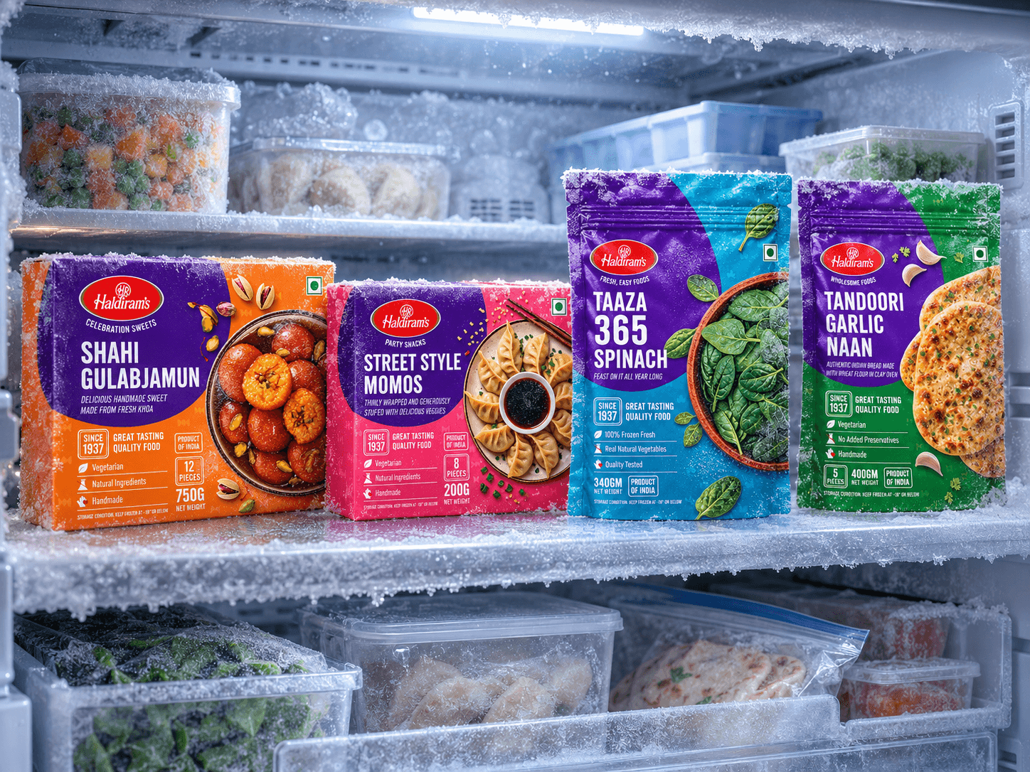
Purple was established as the common anchor colour across all four categories, creating an immediate visual connection between the products. Each category was then given its own background colour and pattern, allowing it to be identified at a glance while still belonging to the same family. This created a balance between unity and differentiation—one Haldiram’s frozen range, with four distinct personalities.
Purple was established as the common anchor colour across all four categories, creating an immediate visual connection between the products. Each category was then given its own background colour and pattern, allowing it to be identified at a glance while still belonging to the same family. This created a balance between unity and differentiation—one Haldiram’s frozen range, with four distinct personalities.


Photography & Imagery
The photography was kept bold, appetising and product-focused, allowing the food to remain the hero of the pack. Large, close-up food imagery creates an immediate appetite appeal, while the styling and supporting ingredients reinforce the character of each category. The imagery works alongside the graphic system rather than competing with it, keeping the overall packaging energetic and contemporary.
The photography was kept bold, appetising and product-focused, allowing the food to remain the hero of the pack. Large, close-up food imagery creates an immediate appetite appeal, while the styling and supporting ingredients reinforce the character of each category. The imagery works alongside the graphic system rather than competing with it, keeping the overall packaging energetic and contemporary.


